Angular Material
by Bill Jellesma2020-11-13 20:45:00

Table of Contents
Buttons. Among other components
Expansion Panels and Accordions
Getting Started
ng add @angular/material on an existing angular application will add angular material. You will be asked which theme that you want to setup (css reference will be added to angular.json), you'll be asked to setup a global typography set (hammer.js will be imported into main.ts), and you'll be asked to setup browser animations (browseranimationmodule will be added to app.module.ts)
Material Module
Usually, it's a good idea to keep all of your material components in a separate module file. Create the module with ng g m material. The following code will import a button component from the material library.
import { NgModule } from '@angular/core';
import {MatButtonModule} from '@angular/material/button';

@NgModule({
  imports: [
    MatButtonModule
  ],
  exports: [
    MatButtonModule
  ]
})
export class MaterialModule { }
Notice we've removed the reference to CommonModule that normally appears when you generate a module via the CLI. This is because this module is only meant to be imported later to app.module.ts. Separating these modules just makes your code more maintainable.
Don't forget to add this module to the imports array of app.module.ts
...
import {MaterialModule} from './material/material.module';
...

@NgModule({
  ...
  imports: [
    ...
    MaterialModule
  ],
  ...
})
Typography
Similar to the bootstrap classes, you can use classes to style sections of your text. This functionality is available out of the boxes as long as you've added Material via the Getting Started section above. For example, if you were to use
<div class="mat-display-4">This is display 4</div>
<div class="mat-display-3">This is display 3</div>
<div class="mat-display-2">This is display 2</div>
<div class="mat-display-1">This is display 1</div>
It will render the text to
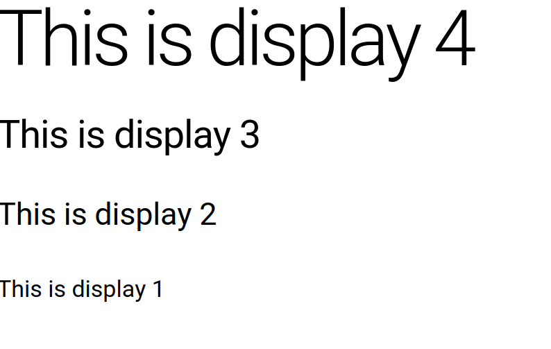 . You can read more about using different classes to style your document by visiting https://material.angular.io/guide/typography.
Buttons. Among other components
Buttons are just one example of a component that you can use with directives imported from the angular material library. To add this and other components to your app, follow the following steps:
- In your
app.module.tsfile, add the following import and add it to the imports array of the@NgModulemetadata.
import {MatButtonModule} from '@angular/material/button';@NgModule({
imports: [
MatButtonModule
],
exports: [
MatButtonModule
]
})Or if you're using the approach of a material module described above in Material Module, add this to the MaterialComponents array.
import {MatButtonModule} from '@angular/material/button';

const MaterialComponents = [
  MatButtonModule
]

@NgModule({
  imports: MaterialComponents,
  exports: MaterialComponents
})- In the HTML template file where you plan to use the button, use HTML similar to the following:
<div>
    <button mat-raised-button>Hello World</button>
    <button mat-fab>Hello World</button>
    <button mat-mini-fab color="primary">Hello World</button>
    <button mat-icon-button color="primary">
        Icon
    </button>
</div>
This will display the following:

You can read more about buttons by visiting https://material.angular.io/components/button/overview or all components by visiting https://material.angular.io/components/categories.
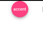
Note: These buttons and other components use the theme chosen by default but this can be modified with the color directive.
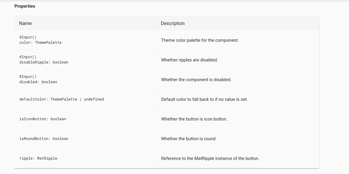
To find these additional attributes that you can use on the tags, you can refer to the properties for the component
Template Reference Variables
Reading the API for some components will give you the properties available to those components.
To access these properties in HTML, you can use template reference variables by using
<button mat-fab #button>{{button.color}}</button>The hashtag directive creates a template reference variable that you can use with interpolation in that same template to access the property values. For example, the above code is accessing the color property available on the button.
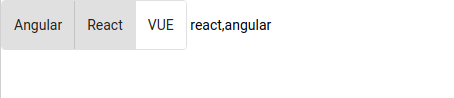
With some components, this template variable will become very important because you can use it to, for instance, display the chose value(s) of a button group.
<div>
    <mat-button-toggle-group #toggleGroup="matButtonToggleGroup" multiple>
        <mat-button-toggle value="angular">Angular</mat-button-toggle>
        <mat-button-toggle value="react">React</mat-button-toggle>
        <mat-button-toggle value="vue">VUE</mat-button-toggle>
    </mat-button-toggle-group>
    {{toggleGroup.value}}
</div>Note: notice that we needed to set the value of the variable to matButtonToggleGroup. This can be seen in the documentation for "exported as"

Will render
Icons
Icons are a slightly different component. In addition to importing it to your module as you normally would, the name used in your tag must be the exact name of an icon available within the documentation. Otherwise, the icon will just display the first character of whatever word you specify. For example the below code renders the below image.
<div>
    <mat-icon>Gravel</mat-icon>
</div>
Because Gravel is not a recognized icon name. Whereas,
<div>
    <mat-icon>gavel</mat-icon>
</div>
Will render
Because gavel is a recognized name.
You can find a list of all icons by visiting https://material.io/resources/icons/?style=baseline
Property Binding
Some components can take advantage of conditional statements using property binding. For example, in the following HTML, the badge will appear hidden if the number of notification (defined in the component class) is zero.
<div>
    <span matBadge={{notifications}} matBadgeOverlap="false" [matBadgeHidden]="notifications === 0">Notifications</span>
</div>
Sidenav
The sidenav component is also a little different in that you will need to create a container element. Notice also in the below HTML code that the button's click event will simply set opened equal to the opposite of the opened value. This is a quick way to toggle the opening and closing of the sidenav
<mat-sidenav-container>
    <mat-sidenav opened={{opened}}>Sidenav</mat-sidenav>
    <mat-sidenav-content>Main
        <button (click)="opened=!opened">Toggle Open</button>
    </mat-sidenav-content>
</mat-sidenav-container>
And in the component typescript
export class AppComponent implements OnInit{
  constructor(private dialog: MatDialog){}
  ngOnInit(){}
  opened = true
}
Sidenote If the mode attribute for <mat-sidenav> is set to side may have a more familiar feel. This pushes the content when the sidebar is toggled.
<mat-sidenav-container>
    <mat-sidenav mode="side" opened={{opened}}>Sidenav</mat-sidenav>
    <mat-sidenav-content>Main
        <button (click)="opened=!opened">Toggle Open</button>
    </mat-sidenav-content>
</mat-sidenav-container>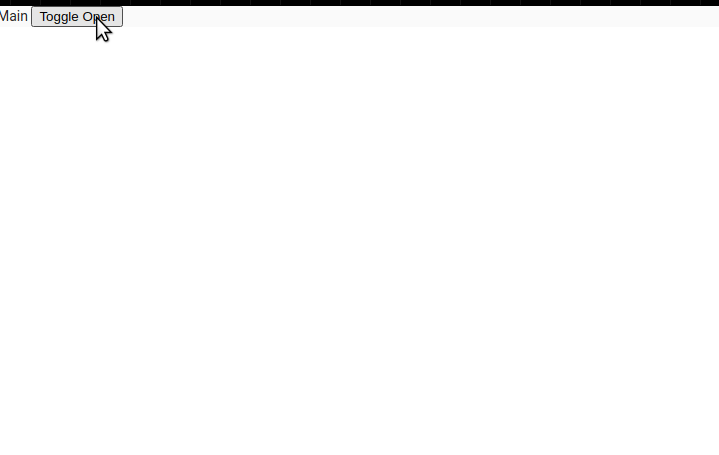
Sidenote You can also use the toggle method rather than setting the opened attribute. This way just requires the use of a template reference variable.
<mat-sidenav-container>
    <mat-sidenav #sidenav mode="push" opened={{opened}}>Sidenav</mat-sidenav>
    <mat-sidenav-content>Main
        <button (click)="sidenav.toggle()">Toggle Open</button>
    </mat-sidenav-content>
</mat-sidenav-container>
Menus
Menus are pretty cool too as you can make use of template variables to define menus and even use <ng-template> to lazy load in dynamic content
<mat-menu #appMenu="matMenu" xPosition="after" yPosition="above">
    <button mat-menu-item [matMenuTriggerFor]="subMenu">Frontend</button>
    <button mat-menu-item>Backend</button>
</mat-menu>

<button class="center" mat-flat-button [matMenuTriggerFor]="appMenu">Menu</button>

<mat-menu #subMenu="matMenu">
    <button mat-menu-item>Angular</button>
    <button mat-menu-item>React</button>
    <button mat-menu-item>Vue</button>
</mat-menu>
<mat-menu #lazyMenu="matMenu">
<ng-template matMenuContent let-name="name" let-hobby="hobby">
<button mat-menu-item>Settings {{name}}</button>
<button mat-menu-item>Logout {{hobby}}</button>
</ng-template>
</mat-menu>
<button [matMenuTriggerData]="{name: 'Bill', hobby: 'TV'}" [matMenuTriggerFor]="lazyMenu">Click</button>
<button [matMenuTriggerData]="{name: 'Jim', hobby: 'Football'}" [matMenuTriggerFor]="lazyMenu">Here</button>Lists
Lists are fairly easy from the documentation but one cool use is for navigation.
<mat-list>
    <mat-list-item>
        <mat-icon matListIcon>home</mat-icon>
    </mat-list-item>

</mat-list>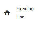
Grid
For those familiar with the bootstrap grid system, Angular Material also has their own grid system. This grid system works by specifying directives.
<mat-grid-list cols="2" rowHeight="4:1">
    <mat-grid-tile>Tile</mat-grid-tile>
    <mat-grid-tile>Tile</mat-grid-tile>
    <mat-grid-tile>Tile</mat-grid-tile>
    <mat-grid-tile>Tile</mat-grid-tile>
</mat-grid-list>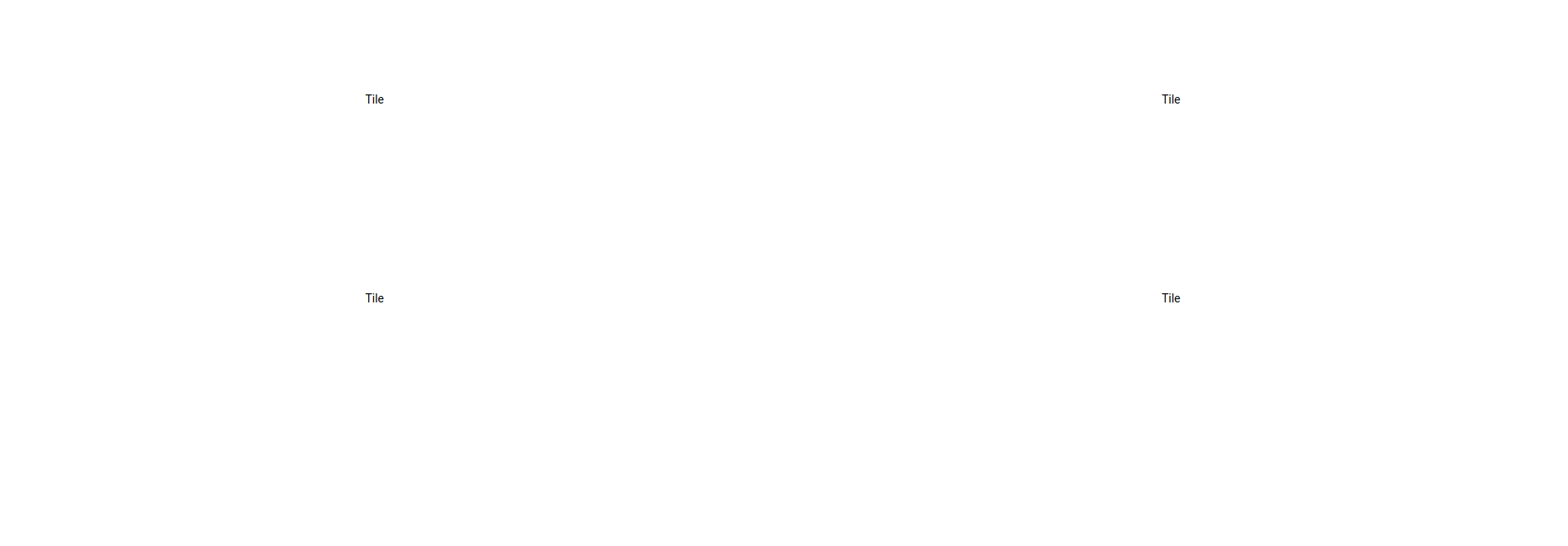
Expansion Panels and Accordions
Expansion Panels are of particular note because they can be used to save a lot of screen real estate.
<mat-expansion-panel>
    <mat-expansion-panel-header>
        <mat-panel-title>
            Title
        </mat-panel-title>
        <mat-panel-description>
            Details
        </mat-panel-description>
    </mat-expansion-panel-header>
    <p>This is the panel content</p>
</mat-expansion-panel>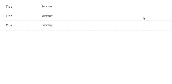
You can make this into a set where when one is opened, all others one will be closed. This is referred to as an accordian

Stepper
Steppers are another component of note because they create a type of wizard for your application. You can make these steps mandatory on the frontend by adding a linear attribute to the mat-horizontal-stepper or mat-verical-stepper tags. You can then add a completed attribute to each step
<mat-horizontal-stepper linear>
    <mat-step label="Shipping Address" completed=false>Shipping</mat-step>
    <mat-step label="Billing Address" completed=false>Shipping</mat-step>
    <mat-step label="Order Details" completed=false>Shipping</mat-step>
</mat-horizontal-stepper>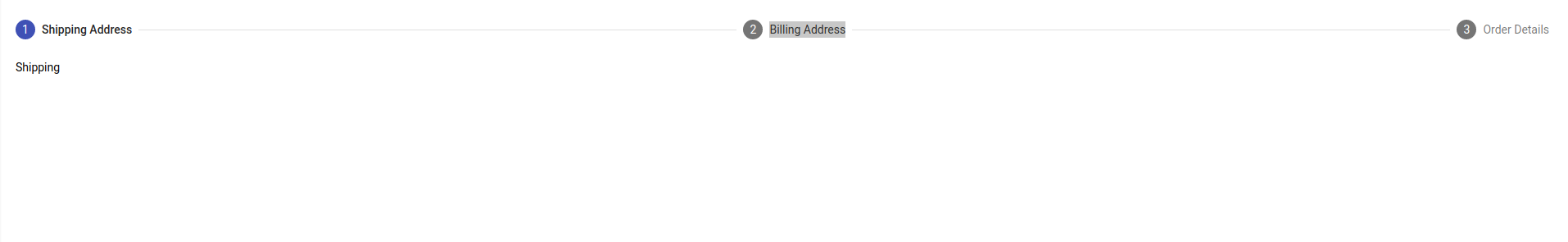
Forms
Whenever dealing with forms in Angular Material, you must first import the MatFormFieldModule. For example, if you're planning to use the inputs, you must import both form field and input in @ngModule
import {MatFormFieldModule} from '@angular/material/form-field';
import {MatInputModule} from '@angular/material/input';
@NgModule({
imports: [
...
MatFormFieldModule,
MatInputModule
],
...
})<mat-form-field appearance="standard">
<mat-label>Name</mat-label>
<input matInput required>
</mat-form-field>It may also be worth mentioning how to get the value from a select group. This is a little different as you'll want to declare a variable in your component class first and then bind that value to the HTML.
export class AppComponent {
  selectedValue;
}
<mat-form-field>
<mat-label>Topic</mat-label>
<mat-select [(value)]="selectedValue">
<mat-option value="angular">Angular</mat-option>
</mat-select>
</mat-form-field>
{{selectedValue}}Autocomplete
Autocomplete can be difficult to implement if you want it to filter the text as you type like in the below gif.
To accomplish this, you'll need to import ReactiveForms in app.module.ts.
import {FormsModule, ReactiveFormsModule} from '@angular/forms'Import the following from rxjs into your component class
import {Observable} from 'rxjs'
import {map, startWith} from 'rxjs/operators'
Add the following functions to your component class
export class AppComponent implements OnInit {
  options: string[] = ['Angular', 'React', 'Vue']
  control = new FormControl()
  filteredOptions: Observable<string[]>

  // When the component is initialized
  ngOnInit() {
    // On every change of the control element
    this.filteredOptions = this.control.valueChanges.pipe(
      startWith(''),
      // map a value back to the filteredOptions Observable
      map(value => {
        return this._filter(value)
      })
    )
  }

  // If the lowercased version of the option inclues and of the text that
  // Was typed, then returned the filtered option
  private _filter(value: string): string[] {
    const filterValue = value.toLowerCase();
    return this.options.filter(option => {
      return option.toLowerCase().includes(filterValue)
    })
  }
}
Finally, use the async pipe in the template file to subscribe to the observable. Don't forget to bind to the form control
<form>
    <mat-form-field>
        <input type="text" matInput [matAutocomplete]="auto" [formControl]="control">
        <mat-autocomplete #auto="matAutocomplete">
            <mat-option *ngFor="let option of filteredOptions | async" [value]="option">
                {{option}}
            </mat-option>
        </mat-autocomplete>
    </mat-form-field>
</form>
Datepicker
DatePicker is another component where you're going to want to import two imports
import {MatDatepickerModule} from '@angular/material/datepicker';
import {MatNativeDateModule} from '@angular/material/core';
@NgModule({
imports: [
...
MatDatepickerModule,
MatNativeDateModule
],
...
})Snackbar
Snackbars are pretty cool for displaying notifications and it even has some observables tied to actions. In the component class, you will want to import a service MatSnackabar and inject it into your class.
import {MatSnackBar} from '@angular/material/snack-bar'export class AppComponent{
constructor(private snackBar: MatSnackBar){
}
openSnackBar(message, action){
let snackBarRef = this.snackBar.open(message, action)
// this observable will fire after the action has been clicked
snackBarRef.afterDismissed().subscribe(() => {
console.log('dismissed')
})
// this observable will fire when an action has occured
snackBarRef.onAction().subscribe(() => {
console.log('triggered')
})
}
}In the template file, you will simply create a click handler.
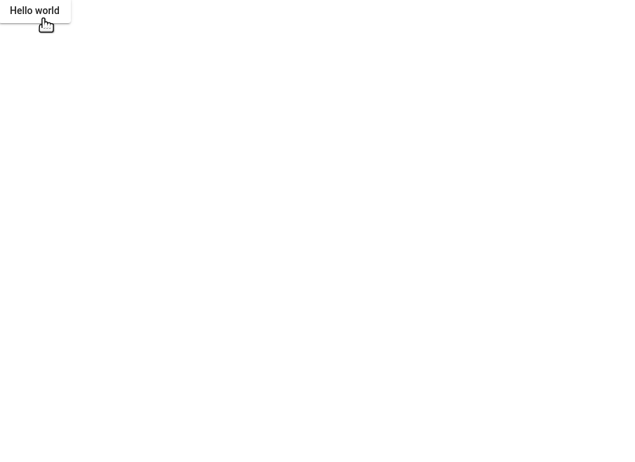
<button mat-raised-button (click)="openSnackBar('Item Deleted', 'Dismiss')">Hello world</button>Dialog
Probably the most liked feature of Bootstrap (by me) was modals. Angular Material uses components referred to as Dialogs that act as these and they turn out to be pretty easy to use. They do involve injecting a service which is similar to the snackbars above.
- First this would be to start on the component that you want to use to open this dialog. The following HTML specifies using a click event which will call a method named
openDialogthat we will define in the next step.
<button mat-raised-button (click)="openDialog()">Hello world</button>- Of course, we want to define the method that we defined. In order for dialogs to work, they rely on an Angular Service that we will inject into this calling component. With our service defined, we'll call another component to serve as the body of the dialog. For this example, this component is called
DialogComponentand we'll also import this so that we can use it in theopenDialog()method
import {MatDialog} from '@angular/material/dialog';
import {DialogComponent} from './dialog/dialog.component'
export class AppComponent{
constructor(private dialog: MatDialog){}
openDialog(){
this.dialog.open(DialogComponent)
}
}- In our newly created component's template file, we can make use of several directives to style our modal
<h2 mat-dialog-title>Session Timeout</h2>
<mat-dialog-content>Content</mat-dialog-content>
<mat-dialog-actions>
    <button mat-button mat-dialog-close>Logout</button>
</mat-dialog-actions>
Like the snackbar, you are able to create actions when the user closes the dialog by subscribing to an observable. To demo this, we'll edit the dialog template slightly to pass some text on close. We'll simply set the mat-dialog-close directive to be equal to a string called Hello
<h2 mat-dialog-title>Session Timeout</h2>
<mat-dialog-content>Hi {{data.name}}</mat-dialog-content>
<mat-dialog-actions>
    <button mat-button mat-dialog-close="hello" >Logout</button>
</mat-dialog-actions>
In the calling component class, we subscribe to an observable
export class AppComponent{
  constructor(private dialog: MatDialog){}

  openDialog(){
    let dialogRef = this.dialog.open(DialogComponent, {data: {name: 'Bill'}})

    // observable for when the dialog is closed
    dialogRef.afterClosed().subscribe(result => {
      console.log(`Dialog Result: ${result}`)
    })
  }
}
It's also very useful to be able to specifically pass data to the dialog. All applications of modals in bootstrap that I've used have required me to pass data.
- When defining the variable in the calling component class, we'll pass a second parameter to the open method that is an object.
export class AppComponent{
  constructor(private dialog: MatDialog){}

  openDialog(){
    let dialogRef = this.dialog.open(DialogComponent, {data: {name: 'Bill'}})
  }
}- In the component class that fills the dialog (
dialog.component.tsif you're following along), import the inject command from the angular core library and importMAT_DIALOG_DATAfrom the material library to get the passed data. We want to passMAT_DIALOG_DATAas an injection token to the constructor and use that to define the data property. Notice that data is defined as public so that the dialog can access this.
import { Component, OnInit, Inject } from '@angular/core';
import {MAT_DIALOG_DATA} from '@angular/material/dialog'
export class DialogComponent implements OnInit {
constructor(@Inject(MAT_DIALOG_DATA) public data: any) { }
ngOnInit(): void {
}
}- Finally, we can simply interpolate the data variable in the template
<h2 mat-dialog-title>Session Timeout</h2>
<mat-dialog-content>Hi {{data.name}}</mat-dialog-content>
<mat-dialog-actions>
    <button mat-button mat-dialog-close="hello" >Logout</button>
</mat-dialog-actions>
Passing data back to the parent
If you have something like a form in your dialog component, it will be useful to be able to send data from the child back to the parent component.
- In the child component, along with importing
MAT_DIALOG_DATAalso import aDialogRef
import {MAT_DIALOG_DATA, MatDialogRef} from '@angular/material/dialog' constructor(@Inject(MAT_DIALOG_DATA) public data: any, public dialogRef: MatDialogRef<any>) { }- You can now create a method that uses this
DialogRef
saveData(): void {
    // Use the close method to pass data back to the parent component
    this.dialogRef.close({
      'data': data
    })
  }
}- Back on the parent component, we'll now subscribe to the close observable like we did before
// observable for when the dialog is closed
    dialogRef.afterClosed().subscribe(result => {
      console.log(`Dialog Result: ${result}`)
    })
Tables
Tables are always a very big component in applications. Angular Material has many operations that apply to their version of tables ranging from basic tables to paginated and sorted tables.
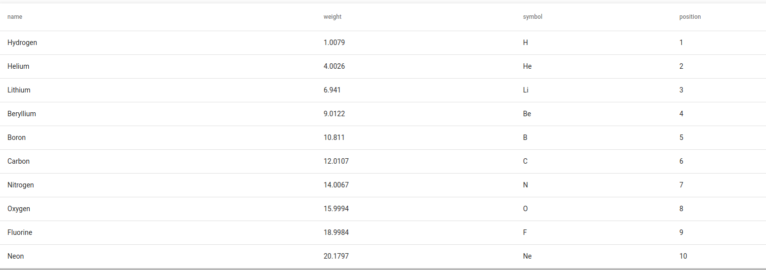
- Edit the component class to contain the data. We'll also define an interface as the top to ensure that our objects in the table are properly typed. We'll put this below the import statements.
export interface PeriodicElement {
  name: string;
  position: number;
  weight: number;
  symbol: string;
}

const ELEMENT_DATA: PeriodicElement[] = [
  {position: 1, name: 'Hydrogen', weight: 1.0079, symbol: 'H'},
  {position: 2, name: 'Helium', weight: 4.0026, symbol: 'He'},
  {position: 3, name: 'Lithium', weight: 6.941, symbol: 'Li'},
  {position: 4, name: 'Beryllium', weight: 9.0122, symbol: 'Be'},
  {position: 5, name: 'Boron', weight: 10.811, symbol: 'B'},
  {position: 6, name: 'Carbon', weight: 12.0107, symbol: 'C'},
  {position: 7, name: 'Nitrogen', weight: 14.0067, symbol: 'N'},
  {position: 8, name: 'Oxygen', weight: 15.9994, symbol: 'O'},
  {position: 9, name: 'Fluorine', weight: 18.9984, symbol: 'F'},
  {position: 10, name: 'Neon', weight: 20.1797, symbol: 'Ne'},
];- Also in the class component, we'll want to make two variables for the data source, which we'll just set equal to our const data and the displayed columns which will be an array of strings.
export class TableBasicExample {
  displayedColumns: string[] = ['position', 'name', 'weight', 'symbol'];
  dataSource = ELEMENT_DATA;
}- Set a tiny bit of styling so that the table takes the full width of the page.
table {
  width: 100%;
}- Finally, we'll display the table in the template. Notice that
ng-containercan use an*ngFordirective to loop through the columns in a more concise manner.
<table mat-table [dataSource]="dataSource" class="mat-elevation-z8">

  <!--- Note that these columns can be defined in any order.
        The actual rendered columns are set as a property on the row definition" -->

  <!-- Position Column -->
  <ng-container matColumnDef="position">
    <th mat-header-cell *matHeaderCellDef> No. </th>
    <td mat-cell *matCellDef="let element"> {{element.position}} </td>
  </ng-container>

  <!-- Name Column -->
  <ng-container matColumnDef="name">
    <th mat-header-cell *matHeaderCellDef> Name </th>
    <td mat-cell *matCellDef="let element"> {{element.name}} </td>
  </ng-container>

  <!-- Weight Column -->
  <ng-container matColumnDef="weight">
    <th mat-header-cell *matHeaderCellDef> Weight </th>
    <td mat-cell *matCellDef="let element"> {{element.weight}} </td>
  </ng-container>

  <!-- Symbol Column -->
  <ng-container matColumnDef="symbol">
    <th mat-header-cell *matHeaderCellDef> Symbol </th>
    <td mat-cell *matCellDef="let element"> {{element.symbol}} </td>
  </ng-container>

  <tr mat-header-row *matHeaderRowDef="displayedColumns"></tr>
  <tr mat-row *matRowDef="let row; columns: displayedColumns;"></tr>
</table>- The table uses a two way bound
[datasource]directive to specify the array that will be displayed in the table. - The
mat-hear-rowdirective at the bottom uses a*matHeaderRowDefattribute to define the array of column- Notice that the array determines the order of the columns so changing the order will change the order that the columns are displayed in.
- Finally, the
mat-rowdirective will determine the actual data displayed in the table.- The row variable just makes a declaration so that we can use the variable
<tr mat-row (click)="logData(row)" *matRowDef="let row; columns: columnsToDisplay;"></tr>Filtering the table
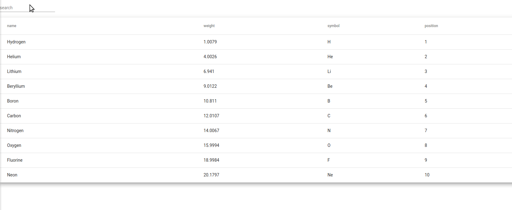
Note Notice in the above that you can also use numbers and filter on the weight.
In order the filter the data in tables as a user types, Angular Material provides a special service that can be used on datatables.
- Import the service and instead of injecting it into the component, use it to create a new array that will hold the data for your table.
import {MatTableDataSource} from '@angular/material/table'export class AppComponent{
constructor(private dialog: MatDialog){}
displayedColumns: string[] = ['name', 'weight', 'symbol', 'position'];
data = new MatTableDataSource(ELEMENT_DATA);
}- Create a filter function on your class that will filter data from the array.
export class AppComponent{
  constructor(){}
  displayedColumns: string[] = ['name', 'weight', 'symbol', 'position'];
  data = new MatTableDataSource(ELEMENT_DATA);

  // Function to filter text entered by the user
  applyFilter(filterValue: string){
    this.data.filter = filterValue.trim().toLowerCase();
  }
}- In the template file, create a form field element that takes the data entered (the data currently in the input is
$event.target.value) that will call theapplyFilter()function on every keystroke event
Sorting
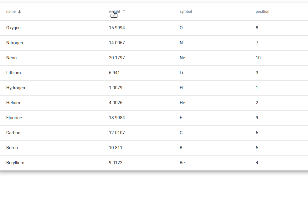
Angular Material uses another module to be able to add sorting to the datatable: MatSortModule.
- The component class will need to import the MatSort Service
import {MatSort} from '@angular/material/sort'- The component class will also need to have imported OnInit and ViewChild from Angular Core
import { Component, OnInit, ViewChild } from '@angular/core';- Also in the Component class, set a sort variable as
@ViewChilddecorator. Make sure that this decorator takes MatSort as an argument as well as an object for setting the query resolver to static
export class AppComponent{
  constructor(){}
  displayedColumns: string[] = ['name', 'weight', 'symbol', 'position'];
  columnsToDisplay: string[] = this.displayedColumns.slice();

  @ViewChild(MatSort, {static: true}) sort: MatSort;

  data = new MatTableDataSource(ELEMENT_DATA);


}- The last part of the component class is to make it implement the OnInit interface so that we have access to the
ngOnInitlifecycle method. InngOnInit(), we will set the sorting property of the data equal to the@ViewChildvariable that we created previously.
export class AppComponent implements OnInit{
  constructor(){}
  displayedColumns: string[] = ['name', 'weight', 'symbol', 'position'];
  columnsToDisplay: string[] = this.displayedColumns.slice();

  @ViewChild(MatSort, {static: true}) sort: MatSort;

  data = new MatTableDataSource(ELEMENT_DATA);

  ngOnInit() {
    this.data.sort = this.sort
  }

}
- The final step is to edit the table in the template. We just want to use the
matSortdirective on thetableelement andmat-sort-headerdirective on each table header, setting it equal to the column value.
<table mat-table matSort [dataSource]="data" class="mat-elevation-z8">
  <ng-container [matColumnDef]="column" *ngFor="let column of displayedColumns">
    <th mat-header-cell mat-sort-header={{column}} *matHeaderCellDef> {{column}} </th>
    <td mat-cell *matCellDef="let element"> {{element[column]}} </td>
  </ng-container>

  <tr mat-header-row *matHeaderRowDef="columnsToDisplay"></tr>
  <tr mat-row *matRowDef="let row; columns: columnsToDisplay;"></tr>
</table>
Pagination
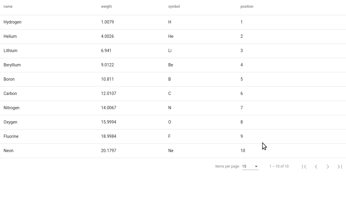
Pagination has very similar steps to sorting. Also, like sorting, there is a separate module for this: MatPaginatorModule.
- The component class will need to import the MatSort Service
import {MatPaginator} from '@angular/material/paginator'- The component class will also need to have imported OnInit and ViewChild from Angular Core
import { Component, OnInit, ViewChild } from '@angular/core';- Also in the Component class, set a sort variable as
@ViewChilddecorator. Make sure that this decorator takes MatSort as an argument as well as an object for setting the query resolver to static
export class AppComponent{
  constructor(){}
  displayedColumns: string[] = ['name', 'weight', 'symbol', 'position'];
  columnsToDisplay: string[] = this.displayedColumns.slice();

  @ViewChild(MatPaginator, {static: true}) paginator: MatPaginator;


  data = new MatTableDataSource(ELEMENT_DATA);


}- The last part of the component class is to make it implement the OnInit interface so that we have access to the
ngOnInitlifecycle method. InngOnInit(), we will set the paginator property of the data equal to the@ViewChildvariable that we created previously.
export class AppComponent implements OnInit{
  constructor(){}
  displayedColumns: string[] = ['name', 'weight', 'symbol', 'position'];
  columnsToDisplay: string[] = this.displayedColumns.slice();

  @ViewChild(MatSort, {static: true}) sort: MatSort;
  @ViewChild(MatPaginator, {static: true}) paginator: MatPaginator;

  data = new MatTableDataSource(ELEMENT_DATA);

  ngOnInit() {
    this.data.sort = this.sort
    this.data.paginator = this.paginator
  }

}
- Finally, we just need to include two directives to initialize our pagination in the template.
<mat-paginator [pageSizeOptions]="[ 5, 10, 15]" showFirstLastButtons></mat-paginator>